Classification

I just found out about Kurt Gebhard Adolf Philipp Freiherr von Hammerstein-Equord, and specifically this wonderful quote of his (emphasis mine):

There are clever, hardworking, stupid, and lazy officers. Usually two characteristics are combined. Some are clever and hardworking; their place is the General Staff. The next ones are stupid and lazy; they make up 90 percent of every army and are suited to routine duties. Anyone who is both clever and lazy is qualified for the highest leadership duties, because he possesses the mental clarity and strength of nerve necessary for difficult decisions. One must beware of anyone who is both stupid and hardworking; he must not be entrusted with any responsibility because he will always only cause damage.

I do not generally like military metaphors, but this classification seems very applicable to the enterprise world. We can all think of that one person who would make an immeasurable contribution to the work by just stopping what they are doing.

See also the VP of Nope.

Power Tools

It’s not easy to hit the right balance between making thing easy for new or infrequent users and enabling power users to be very efficient. It’s even harder for a tool like Slack, which by definition has to be universally adopted in order to succeed.

This is why it’s particularly important to note the discussion about the recent changes to Slack’s editing functionality. The editor used to use Markdown, which is the sort of thing power users love, but others, eh, not so much.

Markdown was created as a a quicker and simple alternative to HTML, but with the aim of catering to the sort of people who would otherwise be crafting HTML by hand in a text editor window. I can pop open BBEdit or vi, start right from

`<html>
<head>
<title>This is my new document</title>`

and go from there, but it’s a bit of a faff. Markdown makes it easy for me, a power user, to be more productive.

The problem with Markdown, especially when it’s implemented inline like Slack did, is that it’s not particularly discoverable. Unless you already know what Markdown is and that it’s supported in whatever window you’re typing in, you’re unlikely to stumble across the functionality by accident.

This is why Slack built a rich text editor which shows all the functions – bold, italic, list, hyperlink, and so on – visually in a toolbar. This makes it much easier for people to add formatting to their messages who might never have done so in the past – and anecdotally, that is exactly what I have been seeing. This is known as a WYSIWYG editor, where the acronym stands for "What You See Is What You Get". Appropriately enough, I first became familiar with the concept when the first WYSIWYG editors for HTML started to come out. Those of us who were used to hand-crafting our HTML by hand in text editors scoffed at the inelegant HTML these tools produced, but they were quickly adopted by vast numbers of people who had been intimidated or were simply turned off by the blank stare of a new text editor window.

WYSIWYG tools are a major democratising force, opening up functionality to huge groups of users who would not otherwise have had access to them. However, as with many user-assistive functionalities, they need to be implemented with care so that they do not become obstacles for users who do not require (or prefer to do without) their assistance.

Uh oh, it looks like your embed code is broken.

The problem in Slack’s case is that the way the WYSIWYG editor is implemented breaks Markdown quite badly. In fact, the reaction got so bad that there is a Chrome plugin to disable the new editor.

To their credit, Slack are apparently walking back the changes and will rethink their approach:

Our recently introduced WYSIWYG formatting toolbar was developed with that broader customer community in mind. We thought we had nailed it, but we have seen an outpouring of feedback from customers who love using Slack with markup.

I don’t necessarily blame Slack for the original miss; it’s not easy to combine direct editing with WYSIWYG in the same window, and testing for all the edge cases of a markup language like Markdown is by definition a hard problem. It’s also worth noting that, in terms of percentage of user base, these Markdown issues will hit a very small number of people. The problem is that those are also the most passionate and dedicated users, so upsetting them will have disproportionate effects on user satisfaction overall. Also, kudos to Slack for listening to feedback and revisiting the changes.

This whole débacle does speak to a more general problem though. I liked early search engines, where you could type

"this phrase" AND "that phrase"

with a reasonable expectation of getting only matches that contained both of those phrases. Instead, search engines nowadays will "helpfully" try to work out what you really meant and return that instead, and it is frustratingly hard to persuade them to stop trying to help and get out of my way.

Providing assistive interfaces for those who need them is both a Good Thing in general, and good for product growth. Power users who are dedicated to learning something will jump through whatever hoops they need to jump through, but casual users will bounce off a learning curve that is too steep. The best match would seem to be a toggle somewhere that lets power users turn off the helpful interjections and talk directly to the machine (see also: autocorrect).

By giving both groups of users what they need, a user interface with this dual nature will both deliver easy onboarding of new users, and enable power users to work efficiently. I hope Slack figures it out quickly and becomes an example of Doing It Right.

Won’t Somebody Think of the (Virtual) Users?

Here’s the thing with VR: nobody has yet figured out what – or who – it’s actually for.

It seems like you can’t throw a rock without hitting some wild-eyed evangelist for VR. Apparently the next big thing is going to be VR tourism. On the one hand, this sort of thing could solve problems with overcrowding. Imagine if instead of the Mona Lisa, smaller than you expected, behind a barrier of smudged glass and smartphone-wielding fellow tourists, you could spend undisturbed time as close as you wanted to a high-pixel-count scan. And of course, being VR, you could take selfies from any angle without needing to wield a selfie stick or worry about permits for your camera drone.

On the other, you wouldn’t get to spend time in Paris and experience everything else that the city has to offer. At that point, why not just stay home in your favourite chair, enjoying a piped-in virtual experience, like the passengers of the cruise ship in Wall-E?

That’s the question that the VR industry has yet to answer successfully. Much like commercial-grade fusion power, it remains fifteen years away, same as fifteen years ago, and fifteen years before that. In fact, back at the tail end of last century, I played Duke Nukem 3D in a pub1 with goggles, a subwoofer in a backpack, and something called a 3D mouse. The whole thing was tethered to a pretty hefty gaming PC, which back then probably meant a 166 MHz CPU and maybe a first-gen 3dfx Voodoo graphics card.

It was fun, in the immature way that Duke Nukem was, but once the novelty of looking around the environments had worn off, I didn’t see anything that would make me pay the not-inconsiderable price for a similar setup for myself.

A couple of years ago I was at some tech event or other – maybe MWC? – and had the chance to try the then-new Oculus headset. I was stunned at how little the state of the art had moved forward – but that’s what happens when there is no clear use case, no pull from would-be users of the product, just push from people who desperately want to make it happen.

Now, the (virtual) chickens are coming home to roost. This piece in Fast Company admits the problems, but punts on offering any solutions.

The industry raised an estimated $900 million in venture capital in 2016, but by 2018 that figure had plummeted to $280 million. Oculus—the Facebook-owned company behind one of the most popular VR headsets on the market—planned to deliver 1 billion headsets to consumers, but as of last year had sold barely 300,000.

Investments in VR entertainment venues all over the world, VR cinematic experiences, and specialized VR studios such as Google Spotlight and CCP Games have either significantly downsized, closed down, or morphed into new ventures.

[…]

Ultimately it is down to VR developers to learn from existing success stories and start delivering those "killer apps." The possibilities are limited only by imagination.

Apple, more clear-headed than most, is postponing the launch of its own VR and AR efforts. This is particularly significant because Apple has a history of not being the first mover in a market, but of defining the use case such that every other player follows suit. They did not have the first smartphone, or even the first touchscreen, but it’s undeniable that these days almost every phone out there looks like an iPhone.

It’s not clear at this stage whether the delay in their AR/VR efforts is due to technology limitations or the lack of a clear use case, but either way, the fact that they could not see a way to a useful product does not bode well for anyone else trying to make a go of this market.

Shipping The Org Chart

The players who are staying in are the ones who want VR and AR to succeed for their own reasons, not because they see huge numbers of potential users clamouring for it. This is a dangerous road, as Sun found out to their cost, back in the day.

Read the whole thread, it’s gold.

Here’s the problem for VR: while I don’t doubt that there is a small population of hardcore gamers who would love deeper immersion, there is no killer app for the rest of us. Even console gaming is struggling, because it turns out that most people don’t graduate from casual gaming on their smartphones to "serious gaming". This is the other thing that will kill Google Stadia.

The one play that Apple might have is the one that seems to be working with Apple Arcade: first get devices everywhere, then slowly add capabilities. If Apple came out with a physical controller, or endorsed a third-party one, Apple TV would be an interesting contender as a gaming platform. The same thing could work with AR/VR, if only they can figure out a use case.

If it’s just the Google Glass thing of notifications, but RIGHT IN YOUR EYEBALLS, I don’t think it will go anywhere. The only convincing end-user demo I’ve seen is walking or cycling navigation via a virtual heads-up display, but again, that’s a niche use case that won’t support an entire industry.

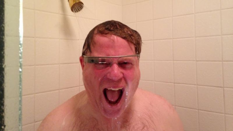
This one image set back the AR industry by decades.

I already don’t have time for video, because it requires me to be somewhere where I can pay attention to video, listen to audio, and not be interrupted for maybe quarter of an hour. Adding the requirement for substantial graphics support and power consumption, not to mention the headset itself, and extending the timeline to match, further reduces the applicability of this technology.

But go ahead, prove me wrong.


🖼️ Top photo by Juan Di Nella on Unsplash


  1. This was back in the good old days before drinking-age laws were introduced, which meant that all of us got our drinking done when all we were in charge of was bicycles, limiting potential damage. By the time we got driving licenses, drinking was somewhat old-hat, so there was much less drive to mix the two. 

Halfway Home

Shot from the midpoint of today’s ride, with the sun just setting behind the clouds.

Conference Booth Do's and Don'ts

Conference season has started up again with a vengeance after the summer break. If you’ve ever staffed or attended a conference, you know that there is always a room (or a hallway, or an out-of-the-way closet) where sponsors can set up more or less elaborate booths and talk to attendees about their offerings.

Staffing a booth is a particular discipline, with significant variations depending on the intersection of which company you represent and which event you are at. Let’s go through some of the factors that go into deciding what goes in a booth – or not.

What is the goal of the sponsorship?

Depending on the company and the event, the goal of an event sponsorship can vary widely. Sometimes you might be there to scan literally every attendee’s badge and get their contact details so that you can follow up later. In this case, you want the flashy giveaway, the must-play game, and in general the fun, look-at-me booth. You also want to make sure that you can process people through pretty quickly; it’s a numbers game.

In other situations – different event audience, or different product and pitch on your part – that is exactly the opposite of what you want. You are aiming for a smaller number of longer and deeper conversations. The sorts of attendees you want will be turned off by queues or flashy displays, and may prefer a sit-down conversation to standing at a demo pod.

Make sure that both sales and marketing agree on the goals! I have personally been involved in events that Marketing considered a great success – "look at how many leads we generated!" – but Sales ignored as a waste of time – "those leads don’t convert". Have that conversation up front, because afterwards it’s too late.

Outside help

At many events, at least some of the booth staffers will be outside contractors, not employees of the company sponsoring the booth. A few years ago "contractor" would have been a euphemism for "booth babe", someone significantly younger than the average conference attendee, generally of the opposite sex to most of the attendees, and wearing significantly less clothing. This kind of contractor is there mainly as eye candy to attract passing traffic.

At least at the sort of conference I go to, the straight-up "booth babe" sort of thing has more or less completely died out – and good riddance to it. Even so, there are still a lot of contractors about, especially at larger events such as Mobile World Congress. They are there to give a pre-rehearsed short pitch and hand out collateral and swag, no more.

There is nothing inherently wrong with using outside help in this way, but it does influence what the typical attendee experience of your booth will be – and therefore what type of leads you will get.

Be in the room

If you’re working a booth, again, know what your goal is. If you want all the leads you can get, go stand out in the hallway with an armful of T-shirts or beer coozies or whatever your giveaway is, and scan everybody in sight. If you’re after more in-depth conversations, stay in your booth perimeter and wait for people to come to you.

Either way, don’t just hang out in the booth, playing with your phone or talking to your colleagues – and definitely don’t get out the laptop and try to work in the booth. You’re there to be available to attendees! If you need to do something urgently, step out of the booth, find a café or whatever, and work from there. There may be a sponsor lounge, or if you’re a speaker there is almost always some sort of green room with WiFi and coffee – and with any luck, a somewhat ergonomic table to work at.

Booth design matters

The booth design is also a factor, and it will change based on your company’s market profile, the event, and once again, your goal for the event. If your company is well-known enough that people will stop by just to see what you’re up to or grab the latest swag, your booth needs to be all about whatever is the newest thing you want to get out there. If you are a startup or a new entrant, you need something eye-catching that explains what your core value proposition is. Either way, keep it simple: nobody reads more than a handful of words on a booth, and they need to be able to do that from a distance, on the move, with a crush of people between them and you.

Different events may also need different designs. If you’re at, say, a Gartner event where most of the attendees are dressed formally, you need to be a bit more grown up too, both in wording and in presentation. Focus on business value and outcomes rather than tech buzzwords. On the other hand, if you’re at a tech-centric event where most people are wearing black T-shirts, you want that checklist, and your benefits need to be couched in technical terms too. This is literally a feeds & speeds crowd, and you should cater to that.

Collateral and handouts

Collateral is a hard one. I have long advocated doing away with take-home collateral entirely, and instead offering to email people about topics they care about – which is an excuse to have a conversation and uncover those topics! You might also consider a row of QR codes on a wall that people can scan to request particular items. This is both more ecological and more practical, since most printed collateral is never read.

However, in certain industries and regions people do actually want something to take away with them, so be aware of those preferences and make sure you cater to them.

The one piece of printed collateral I do like to have in a booth is an architecture diagram, because you can pick that up and use it as a visual aid in conversations with people, even if they never take it with them. In smaller situations I’ve also done this with a diagram printed on the wall or even a whiteboard in the booth, but when there are multiple people who might need to use the visual tool, it can get messy. Better to have one each!

I wrote down some more in-depth advice about conference collateral here.

Further reading

Those are my thoughts, but here are some more from Cote. There is some excellent advice here – do read it! You can sign up for his newsletter here – and if you like this sort of thing, his podcast is pretty good too.


🖼️ Photos by Jezael Melgoza and Cami Talpone on Unsplash

Problem Solving

Take intractable problem. Abandon intractable problem. Run errands. Return home. Play with coloured pens for a Pomodoro. Transfer clean copy to iPad while Mac updates itself. Accomplishment.

Two key parts: doing something else to give your brain space to mull on the problem, instead of trying to solve it by head-butting a brick wall into submission. And structure your time working on the problem, breaking it into chunks that feel approachable.

Be Smart, Use Dumb Devices

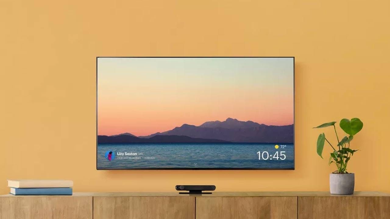
The latest news in the world of Things Which Are Too "Smart" For Their Users’ Good is that Facebook have released a new device in their Portal range: a video camera that sits on your TV and lets you make video calls via Facebook Messenger and WhatsApp (which is also owned by Facebook).

This is both a great idea and a terrible one. I am on the record as wanting a webcam for my AppleTV so that I could make FaceTime calls from there:

In fact, I already do the hacky version of this by mirroring my phone’s screen with AirPlay and then propping it up so the camera has an appropriate view.

Why would I do this? One-word answer: kids. The big screen has a better chance of holding their attention, and a camera with a nice wide field of view would be good too, to capture all the action. Getting everyone to sit on the couch or rug in front of the TV is easier than getting everyone to look into a phone (or even iPad). I’m not sure about the feature where the camera tries to follow the speaker; in these sorts of calls, several people are speaking most of the time, so I can see it getting very confused. It works well in boardroom setups where there is a single conversational thread, but even then, most of the good systems I’ve seen use two cameras, so that the view can switch in software rather than waiting for mechanical rotation.

So much for the "good idea" part. The reason it’s a terrible idea in this case is that it’s from Facebook. Nobody in their right mind would want an always-on device from Facebook in their living room, with a camera pointed at their couch, and listening in on the video calls they make. Facebook have shown time and time and time again that they simply cannot be trusted.

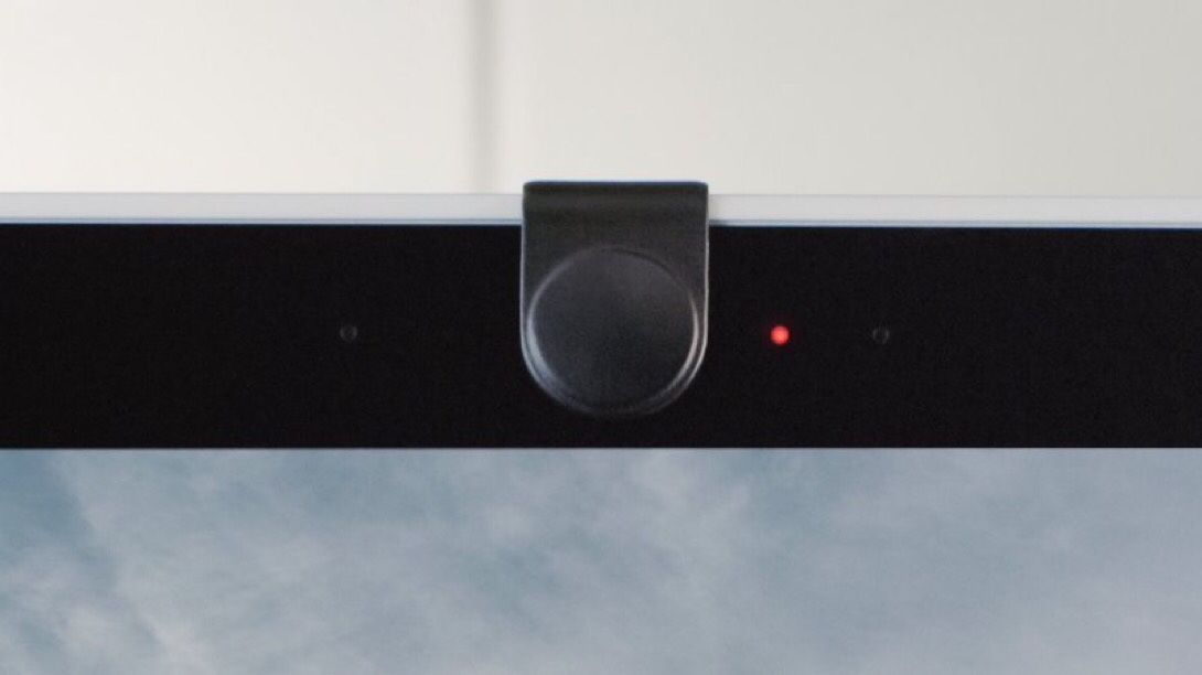
An example of why the problem is Facebook itself, rather than any one product or service, is the hardware switch for turning the device’s camera off. The highlight shows if the switch is in the off position, and a LED illuminates… to show that the camera and microphone are off.

Many people have commented that this setup looks like a classic dark pattern in UX, just implemented in hardware. My personal opinion is that the switch is more interesting as an indicator of Facebook’s corporate attitude to internet services: they are always on, and it’s an anomaly if they are off. In fact, they may even consider the design of this switch to be a positive move towards privacy, by highlighting when the device is in "privacy mode". The worrying aspect is that this design makes privacy an anomaly, a mode that is entered briefly for whatever reason, a bit like Private or Incognito mode in a web browser. If you’re wondering why a reasonable person might be concerned about Facebook’s attitude to user privacy, a quick read of just the "Privacy issues" section of the Wikipedia article on Facebook criticism will probably have you checking your permissions. At a bare minimum, I assume that entering "privacy mode" is itself a tracked event, subject to later analysis…

Trust, But Verify

IoT devices need a high degree of trust anyway because of all the information that they are inherently privy to. Facebook have proven that they will go to any lengths to gather information, including information that was deliberately not shared by users, process it for their own (and their advertising customers’) purposes, and do an utterly inadequate job of protecting it.

Uh oh, it looks like your embed code is broken.

The idea of a smart home is attractive, no question – but why do the individual devices need to be smart in their own right? Unnecessary capabilities increase the vulnerability surface for abuse, either by a vendor/operator or by a malicious attacker. Instead, better to focus on devices which have the minimum required functionality to do their job, and no more.

A perfect example of this latter approach is IKEA’s collaboration with Sonos. The Symfonisk speakers are not "smart" in the sense that they have Alexa, Siri, or Google Assistant on board. They also do not connect directly to the Internet or to any one particular service. Instead, they rely on the owner’s smartphone to do all the hard work, whether that is running Spotify or interrogating Alexa. The speaker just plays music.

I would love a simple camera that perched on top of the TV, either as a peripheral to the AppleTV, or extending AirPlay to be able to use video sources as well. However, as long as doing this requires a full device from Facebook1 – or worse, plugging directly into a smart TV2 – I’ll keep on propping my phone up awkwardly and sharing the view to the TV.


  1. Or Google or Amazon – they’re not much better. 

  2. Sure, let my TV watch everything that is displayed and upload it for creepy "analysis".3 

  3. To be clear, I’m not wearing a tinfoil hat over here. I have no problem simply adding a "+1" to the viewer count for The Expanse or whatever, but there’s a lot more that goes on my TV screen: photos of my kids, the content of my video calls, and so on and so forth. I would not be okay with sharing the entire video buffer with unknown third parties. This sort of nonsense is why my TV has never been connected to the WiFi. It went online once, using an Ethernet cable, to get a firmware update – and then I unplugged the cable. 

New York, New York

This has been a great week in New York City. I was in town for New Hire Technical Training, or NHTT to its friends, which means pretty intense ten-hour days on top of the weeks of prerequisites to even get to this point – but it’s New York Freaking City, so I still took time to wander around. One day I got a step count in the 20ks!

Anyway, here are some shots from the week.

Discoverability

As more and more devices around us sprout microphones and "smart" assistant software that listens for commands, various problems are emerging. Much attention is lavished on the Big Brother aspects of what amounts to always-on ambient surveillance, and that is indeed a development that is worth examining. However, today I would like to focus on another aspect of voice-controlled user interfaces: when a system has no easy way of telling you what its capabilities are – how do you know what to ask it?

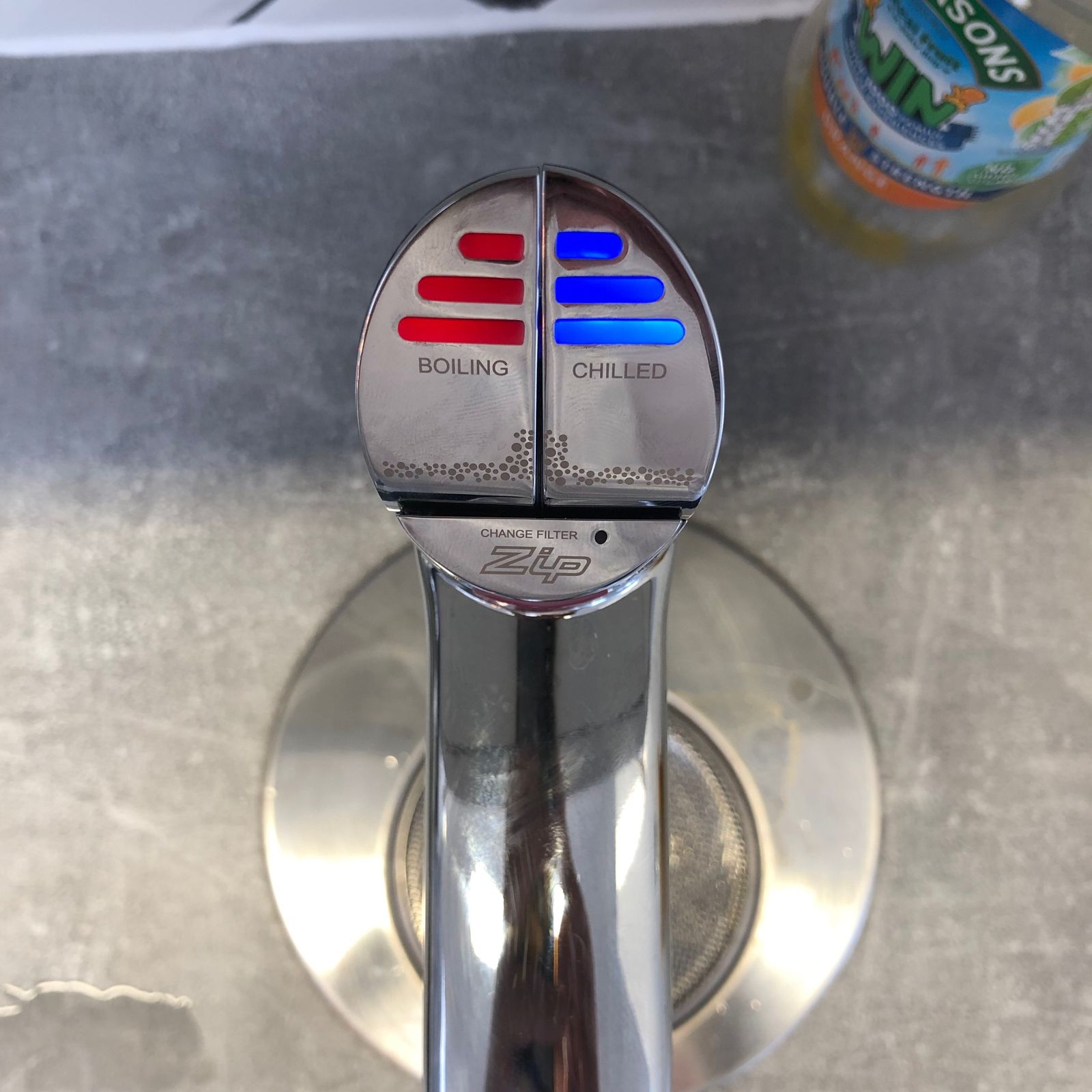
The answer to this question entails discoverability, and I would like to illustrate this somewhat abstract concept with a picture of a tap. This particular tap lives in my employers’ newly refurbished London office, and I challenge you to work out how to get sparkling water from it.

The answer is that you press both taps – and now that I’ve told you, you may perhaps notice the pattern of bubbles along the bottom of the two taps. However, without the hint, I doubt you would ever have worked it out.

Siri, Alexa, Cortana1, and their ilk suffer from the same problem – which is why most people tend to use them for the same scant handful of tasks: setting timers, creating reminders, and playing music. Some users are willing to experiment with asking them to do various things, but most of us have enough going on in our lives that we can’t take the time to talk to very stupid robots unless we have a reasonable certainty of our requests being understood and acted upon.

Worse, even as existing capabilities improve and new ones are added, users generally stick to their first impressions. If they tried something a couple of years ago and it didn’t work then, as far as they’re concerned it doesn’t work, even if that particular capability has been added in the meantime.

I generally find out about new Siri features from Apple-centric blogs or podcasts, but that’s only because I’m the sort of person who goes looking for that kind of thing. I use Siri a fair amount, especially while driving, although AirPods have made me somewhat more willing to speak commands into thin air, so I do actually take advantage of new features and improved recognition. For most people, though, Siri remains the butt of jokes, no matter how much effort Apple puts into it.

This is not a competitive issue, either; almost everyone I know with an Alexa just treats it as a radio, never using any other skills beyond the first week or so of ownership.

The problem is discoverability: short of Siri or Alexa interrupting you ("excuse me, have you heard the good news?"), there isn’t any way for users to know what they can do.

This is why I am extremely sceptical of the claims that voice assistants are the next frontier. Even beyond the particular issues of people in an open-plan office all shouting at their phones, and assuming perfect recognition by the AIs2 themselves, voice is an extremely low-bandwidth channel. If my hands and eyes are available, those are far better input and output channels than voice can ever be. Plus, graphical user interfaces are far better able to guide users to discover their capabilities, without degenerating into phone menu trees.

Otherwise, you have to rely on the sorts of power users who really want sparkling water and are willing to spend some time and effort on figuring out how to get it. Meanwhile, everyone else is going to moan and gripe, or bypass the tap entirely and head for the bottled water.


  1. I find it significant that autocorrect knows the first two, but not the third. As good an indication as any of their relative market penetration. 

  2. Not actually AI. 

Don't Blame The User

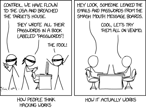
It would be easy to write a blog post about every single XKCD strip, so I try not to – but the latest one drives at something very interesting in infosec.

Some of the default infosec advice that is always given out is to avoid reusing passwords on different sites. This is good advice as far as it goes, but it misses one key aspect. Too many sites force people to create accounts for no good reason ("create an account to use our free wifi"), and so people use throwaway passwords, and reuse them across many of these low-risk sites. In the XKCD example above, if someone cracks the Smash Mouth message boards, maybe they get to reuse the password to gain access to the Limp Bizkit boards, but ideally they won’t get access to Venmo, because that not only has a different, higher-grade password, but is also secured by 2FA1.

The good news is that it’s becoming easier than ever to generate secure passwords and avoid reusing them. If you’re an Apple user, the iCloud Keychain is built right into both iOS and macOS, and will generate and remember secure passwords for you, securing them with FaceID or TouchID. There are of course any number of third-party options as well, but the point is that security needs to be easy. People who care about security will sign up for Have I Been Pwned; general users just trying to get through their day will not.

The first priority is making it work at all, the second is making it usable; regrettable as it may be, security comes after those primary concerns. The easier it is for users to do the right thing, the more likely it is that they will do it. Browbeating them after a breach because they didn’t jump through precisely the right hoops in exactly the right sequence is not helpful. What will help is putting the effort into helping them up front, including in the service design itself.

Previously, previously.


  1. Note, I have no idea whether Venmo actually supports 2FA; not being in the US, I don’t / can’t use it. For "Venmo", read "online banking" or whatever other high-security example.