Of all the inconvenient times for my car's rampant hypochondria to manifest itself, the Sunday evening before an early-morning Monday jaunt to the airport is the worst.
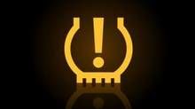
Last time it was tyre pressure. The warning light came on, so I dutifully stopped to check everything out. The shortfall was smaller than the measurement interval afforded by the compressed air machine on a petrol station forecourt, but I managed to get enough air in to turn the light off. Coughing into the hose would probably have given enough pressure…

This time it was oil. The dipstick assured me there was plenty of oil, but I don't like warning lights, so I stopped at the first petrol station on the motorway at o'dark-hundred on a Monday morning to buy some engine oil. Of course they were out of the type of oil that the Beast's exacting tastes require, so I had to go on to the next place. This place did stock the right approved oil, so I was able to continue my journey fully lubed up.
This sort of thing is why I hate idiot lights. Give me a measurement! These days, with any number of digital displays on cars' dashboards, lack of real estate is no excuse. The Beast is actually pretty good about this, with physical gauges for both oil and water temps as well as turbo boost pressure. There is also a display for tyre pressure that can be put up in the central virtual gauge in front of the driver, between the speed and RPM.
What drove me nuts about my old car was the lack of these displays. On a turbo diesel, especially when cold, you don't want the turbocharger spooling straight away - but it's really hard to avoid it when the only instruments you have to measure boost pressure are RPM and engine noise!
Software designers on the other hand have a tendency to go the opposite way, with too much information being thrown at the user without context. The happy medium is to show the information, but include some context indicating what is good and expected, as opposed to what is out of the ordinary. Here car dashboards show the way: don't just have an idiot light that comes on when the driver is going "too fast". Instead, have nice big clear dials showing vehicle speed and RPM - but include red lines on both displays to indicate where the danger areas are.
Note: I’m not implying that all information should be displayed all the time. Software developers often fall into the trap of displaying every piece of information they can get their hands - well, digits, anyway - onto. The only result of this smorgasbord approach is to overwhelm users. This way, important things can easily get drowned in the noise. Operators then end up missing some thing important.

The most famous recent example of users drowning in data and missing the one really important piece of information was probably at Target. You may remember Target from such data breaches as The Largest Retail Hack in U.S. History - well, until Home Depot, at least.
The most interesting aspect to me, however, was that Target did in fact have systems in place to detect exactly the sort of activity that was involved in the breach. Those systems worked perfectly, and did indeed detect the breach in progress and alert operators. The operators simply missed the alarms.
How does that happen? Easily. At any given time there are scads of alerts flying around any sizeable IT environment. The trick is filtering out the all-important signal from the all-consuming noise - and this is where Target failed.
Target should not be blamed too much, though - most IT organisations are in exactly the same situation. The problem in IT used to be about too little information - but now it’s about too much.

And now is where I finally get to my point. My new gig is for a company called Moogsoft, which is working to solve precisely this problem. Our technology is able to sift automatically through masses of raw event data, figure out what is important, and show those important alerts to the people who can actually do something about it. The way we do that is with various algorithms, and I can geek out for quite some time on the information theory aspects of that - but the proof is in the results we are already bringing our customers.
Bottom line: information is good, but it has to be possible for users to consume it. Useful1 context is critical for people to be able to make sense of data instead of simply being overwhelmed.
-
"Useful" is key here. Those nagging displays that prompt drivers to shift to another gear are the opposite of that. It's not like they come on at a million RPM just before all the valves come out of the engine; in many cases they come on just as you enter the engine's power band. This is the opposite of a safety feature, overwhelming the user with pointless information. ↩