Showing all posts tagged ux:

Say Comma Again, I Dare You

For my sins, I have been working with CSV files in Excel again — and it's giving me an aneurysm, as usual.

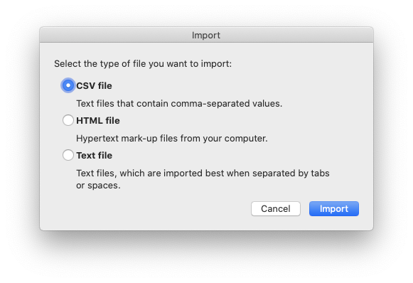
If you haven't had the (dis)pleasure, here's how the Import wizard works in Excel. You do File > Import, and choose CSV — so far so good:

Now, make careful note of the explanation: "Text files that contain comma-separated values".

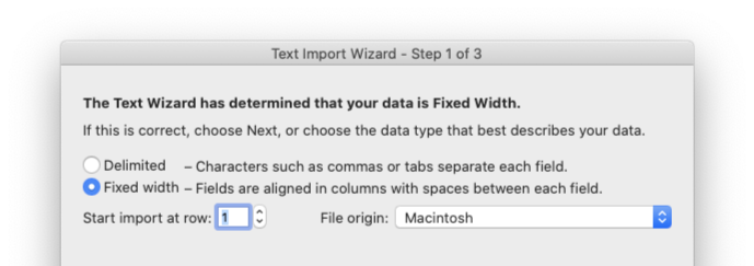
Here is where the insanity begins: the wizard somehow decides that my text is not actually comma-delimited, as per the description above, but fixed-width:

I have no idea how the wizard arrives at this conclusion, because it does it for every single CSV file I have ever fed it.

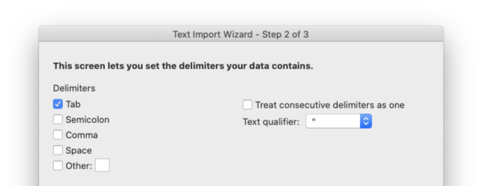
Having reassured the wizard that no, I really do want my text delimited by characters such as, oh for instance commas because this is a file of comma-separated values — guess what the default character is that the wizard suggests?

Sure. Tabs. Not commas, for the file of (once again) comma-separated values. Tabs.

Now this might look like yet another minor annoyance, merely the latest in a series of papercuts that we have to deal with when we work with computers — but it's also a particularly egregious example of why people hate computers so much.

Three Reasons Why This Is a UX Disaster

A computer should never ask the user a question to which it can work out the answer. It should have sane defaults, that work for most users most of the time. Finally, it should implement the user's inputs faithfully.

This wizard falls down on all three fronts:
1) It's a CSV file, you should know it's going to be comma-separated; why are you asking me?
2) Given that it's a CSV, the default should be to import the contents as comma-separated values, not tab-separated. Maybe have an Options button somewhere for weird edge cases, but the default flow if the user hits OK on every screen should make sense for the most usual case of a CSV file containing comma-separated data.
3) Gaslighting the user like this on every screen is just not acceptable. I feel like I'm trying to figure out how to avoid signing up to a junk mailing list, not using an ostensibly professional-grade, market-validated piece of software.

If you're writing even a simple program, at some point you're going to have to figure out inputs and what to do with them. Please, I implore you: do better than Microsoft.

Power Tools

It’s not easy to hit the right balance between making thing easy for new or infrequent users and enabling power users to be very efficient. It’s even harder for a tool like Slack, which by definition has to be universally adopted in order to succeed.

This is why it’s particularly important to note the discussion about the recent changes to Slack’s editing functionality. The editor used to use Markdown, which is the sort of thing power users love, but others, eh, not so much.

Markdown was created as a a quicker and simple alternative to HTML, but with the aim of catering to the sort of people who would otherwise be crafting HTML by hand in a text editor window. I can pop open BBEdit or vi, start right from

`<html>
<head>
<title>This is my new document</title>`

and go from there, but it’s a bit of a faff. Markdown makes it easy for me, a power user, to be more productive.

The problem with Markdown, especially when it’s implemented inline like Slack did, is that it’s not particularly discoverable. Unless you already know what Markdown is and that it’s supported in whatever window you’re typing in, you’re unlikely to stumble across the functionality by accident.

This is why Slack built a rich text editor which shows all the functions – bold, italic, list, hyperlink, and so on – visually in a toolbar. This makes it much easier for people to add formatting to their messages who might never have done so in the past – and anecdotally, that is exactly what I have been seeing. This is known as a WYSIWYG editor, where the acronym stands for "What You See Is What You Get". Appropriately enough, I first became familiar with the concept when the first WYSIWYG editors for HTML started to come out. Those of us who were used to hand-crafting our HTML by hand in text editors scoffed at the inelegant HTML these tools produced, but they were quickly adopted by vast numbers of people who had been intimidated or were simply turned off by the blank stare of a new text editor window.

WYSIWYG tools are a major democratising force, opening up functionality to huge groups of users who would not otherwise have had access to them. However, as with many user-assistive functionalities, they need to be implemented with care so that they do not become obstacles for users who do not require (or prefer to do without) their assistance.

Uh oh, it looks like your embed code is broken.

The problem in Slack’s case is that the way the WYSIWYG editor is implemented breaks Markdown quite badly. In fact, the reaction got so bad that there is a Chrome plugin to disable the new editor.

To their credit, Slack are apparently walking back the changes and will rethink their approach:

Our recently introduced WYSIWYG formatting toolbar was developed with that broader customer community in mind. We thought we had nailed it, but we have seen an outpouring of feedback from customers who love using Slack with markup.

I don’t necessarily blame Slack for the original miss; it’s not easy to combine direct editing with WYSIWYG in the same window, and testing for all the edge cases of a markup language like Markdown is by definition a hard problem. It’s also worth noting that, in terms of percentage of user base, these Markdown issues will hit a very small number of people. The problem is that those are also the most passionate and dedicated users, so upsetting them will have disproportionate effects on user satisfaction overall. Also, kudos to Slack for listening to feedback and revisiting the changes.

This whole débacle does speak to a more general problem though. I liked early search engines, where you could type

"this phrase" AND "that phrase"

with a reasonable expectation of getting only matches that contained both of those phrases. Instead, search engines nowadays will "helpfully" try to work out what you really meant and return that instead, and it is frustratingly hard to persuade them to stop trying to help and get out of my way.

Providing assistive interfaces for those who need them is both a Good Thing in general, and good for product growth. Power users who are dedicated to learning something will jump through whatever hoops they need to jump through, but casual users will bounce off a learning curve that is too steep. The best match would seem to be a toggle somewhere that lets power users turn off the helpful interjections and talk directly to the machine (see also: autocorrect).

By giving both groups of users what they need, a user interface with this dual nature will both deliver easy onboarding of new users, and enable power users to work efficiently. I hope Slack figures it out quickly and becomes an example of Doing It Right.
Discoverability

As more and more devices around us sprout microphones and "smart" assistant software that listens for commands, various problems are emerging. Much attention is lavished on the Big Brother aspects of what amounts to always-on ambient surveillance, and that is indeed a development that is worth examining. However, today I would like to focus on another aspect of voice-controlled user interfaces: when a system has no easy way of telling you what its capabilities are – how do you know what to ask it?

The answer to this question entails discoverability, and I would like to illustrate this somewhat abstract concept with a picture of a tap. This particular tap lives in my employers’ newly refurbished London office, and I challenge you to work out how to get sparkling water from it.

The answer is that you press both taps – and now that I’ve told you, you may perhaps notice the pattern of bubbles along the bottom of the two taps. However, without the hint, I doubt you would ever have worked it out.

Siri, Alexa, Cortana1, and their ilk suffer from the same problem – which is why most people tend to use them for the same scant handful of tasks: setting timers, creating reminders, and playing music. Some users are willing to experiment with asking them to do various things, but most of us have enough going on in our lives that we can’t take the time to talk to very stupid robots unless we have a reasonable certainty of our requests being understood and acted upon.

Worse, even as existing capabilities improve and new ones are added, users generally stick to their first impressions. If they tried something a couple of years ago and it didn’t work then, as far as they’re concerned it doesn’t work, even if that particular capability has been added in the meantime.

I generally find out about new Siri features from Apple-centric blogs or podcasts, but that’s only because I’m the sort of person who goes looking for that kind of thing. I use Siri a fair amount, especially while driving, although AirPods have made me somewhat more willing to speak commands into thin air, so I do actually take advantage of new features and improved recognition. For most people, though, Siri remains the butt of jokes, no matter how much effort Apple puts into it.

This is not a competitive issue, either; almost everyone I know with an Alexa just treats it as a radio, never using any other skills beyond the first week or so of ownership.

The problem is discoverability: short of Siri or Alexa interrupting you ("excuse me, have you heard the good news?"), there isn’t any way for users to know what they can do.

This is why I am extremely sceptical of the claims that voice assistants are the next frontier. Even beyond the particular issues of people in an open-plan office all shouting at their phones, and assuming perfect recognition by the AIs2 themselves, voice is an extremely low-bandwidth channel. If my hands and eyes are available, those are far better input and output channels than voice can ever be. Plus, graphical user interfaces are far better able to guide users to discover their capabilities, without degenerating into phone menu trees.

Otherwise, you have to rely on the sorts of power users who really want sparkling water and are willing to spend some time and effort on figuring out how to get it. Meanwhile, everyone else is going to moan and gripe, or bypass the tap entirely and head for the bottled water.


  1. I find it significant that autocorrect knows the first two, but not the third. As good an indication as any of their relative market penetration. 

  2. Not actually AI.