Showing all posts tagged iphone:

Apple Bottom Drawer

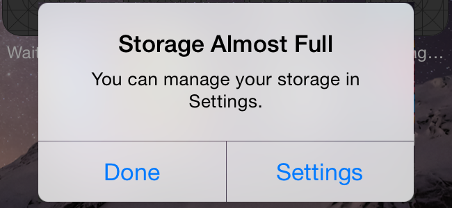
There has been a long-running complaint that equipping the entry-level iPhone with only 16GB of storage is not only cheap, but wrong-headed because owners will have a bad user experience. Most of the time, the example people bring up is operating system upgrades, with people forced to stay on older iOS releases because they don’t have enough free space to perform the upgrade1.

As per their usual tight-lipped policy, Apple has not said anything about precisely why it is that they continue to keep the 16GB models around. The general assumption has been that the idea is to offer a (relatively) low entry price for the iPhone range to get as many people as possible through the door.
url.png

Today, though, I overheard a conversation that illustrated a different reason why Apple might want to increase the storage in that bottom-tier device sooner rather than later. Someone recommended an album, someone else searched for it on iTunes, hit "Buy" - and was told that they did not have enough space. When storage limits are preventing sales, this is a problem.

One obvious quibble would be to ask how many owners of entry-level devices spend significant sums in the iTunes Store (or would do if they had the free space available). This overlooks the fact that these days, a significant number of iPhones are actually corporate-owned or at least -funded. Because the owner is not the user, it is not possible to infer the user’s purchasing power or willingness based on the device they have. Companies may well opt for limited storage because that’s all that is required for work purposes, even though employees would be willing to fill additional space with personal data, given the chance.

Bottom line: it’s high time for the bottom storage tier to move up to 32GB. I would also argue that when they do this, Apple should eat the difference and not raise prices, because their margin is big enough and the parts cost is so small. The improvement in user experience would pay for itself in Tim Cook’s beloved "customer sat", without even allowing for increased revenue per user (ARPU) as people are able and willing to fill up some of that free space.


  1. Yes, I know that you can also upgrade by plugging into iTunes without needing the free space, but these days, many iPhone owners don’t come from the iPod experience and would not necessarily think of that. Many of them in fact don’t even have iTunes installed, or may not even own a PC or Mac in the first place. 

Problems that only affect me

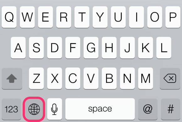
It seems that iOS 8.3 changed something in the way multiple keyboards are handled. If you don't know, you can add keyboards to iOS from Settings > General > Keyboard. This is worth doing even if you only type in one language, because it's how you get access to the Emoji keyboard. Enabling multiple keyboards adds a little "globe" key between the numlock and dictation keys:

skitch.png

Simply tap that "globe" key once to switch to the next keyboard in the list, or hold it to see a menu and select the keyboard you want.

The advantage of having multiple keyboards is that it enables predictive text to work in other languages. It also allows you to choose alternative layouts, e.g. AZERTY for French, QWERTZ for German, or QZERTY for Italian - but I find that confuses me more. Luckily, iOS lets you set all keyboards to use QWERTY.

Now, here's the problem. Before 8.3, if you had a primary keyboard (generally corresponding to your locale), you could switch to another language to type some text. The next time you hit the key, as long as it was within a reasonably short period of time, it would switch you back to your default keyboard. This is great for me, as I type mainly in English, but switch to other languages several times a day.

With 8.3 this behaviour has gone, and the "globe" key always switches to the next keyboard in the list.

This change is probably invisible to almost everyone, and only a minor irritant for those few of us who use multiple input languages frequently, but it is surprisingly annoying when you are used to the old way of things.

I can even understand the rationale, as I have seen people get confused by why the switcher would sometimes go to the next keyboard but at other times revert to the default - but the solution there is to give us preference settings to disable the behaviour entirely or change its timeout. I don't even mind if it's turned off by default, as long as I can turn it back on - but that's not the Apple way.

Sigh.

Wow, these grapes are sour!

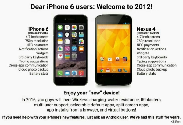
There's this hilarious image going around, welcoming Apple to 2012 or something. It's a "humorous" play on the screen size of the iPhone 6 - and of course the 6 Plus "catches up" to monsters like the Samsung Galaxy Note.

f50619d5aab4281950eeaff4cb61da18.jpg

It's okay, Android users, we get it.

I'm not going to pick this apart (not even the really really ridiculous parts - "Battery stats"? "IR blasters"? really? you're going with that?). I'm just going to point out that in the Android world, "innovation" apparently means "made the screen a bit bigger". "Not making the user's eyes bleed" is apparently not a factor.

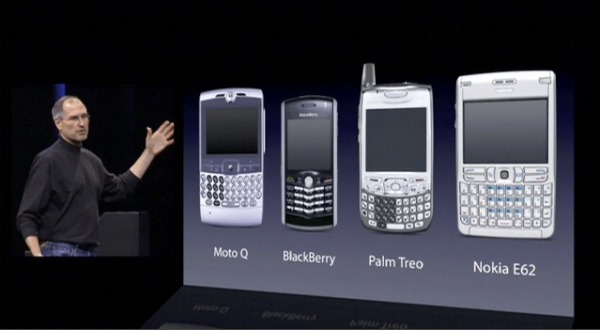
Let's not kid ourselves: phones used to look like all sorts of things, and now they all look like iPhones.1

smartphones.jpg

What drives Android fans crazy is that almost everyone - including most Android users! - sees Android phones as a cheap alternative to an iPhone, not anything to desire in their own right. Sure, there are exceptions - until now, if you wanted a big-screen phone, you had to have Android - but that loophole has now been closed.

Wait till people start asking if their Galaxy Gear or whatever is an old Watch…


  1. Actually, kudos to Blackberry for not only sticking to their keyboard guns, but bringing out the only radically new form factor I've seen in ages in their square Passport phone. It's a pity it probably won't sell in significant enough numbers for anyone to learn whether it can work. 

It's the little things

One of the things that make it most frustrating to use the web from an iPhone is form inputs. Reading the content is generally doable - and if not, there's always Instapaper. But form inputs are always a pain. Partly this is because they're over-styled, so you get stuck with fields that are either tiny or huge. Sure, testing that sort of stuff gets annoying fast. What about the stuff that is easy to do right, though?

One of the things the iPhone does is to show the user a different keyboard depending on the context. If the entry point is in an email address, the keyboard shows characters that are used in email addresses - the @ mark, dashes and underscores, and so on - instead of the space. If it's a phone number, you get a numeric keypad. This makes life much easier.

All of this is driven by the type of the HTML input element. Set it to email, tel or whatever, and let iOS do its thing. But no, nobody bothers to set their input element type, so iPhone users are switching back and forth, hunting and pecking, and all the time hating web developers so very, very much.

And that's just one tip for this useful list of
8 HTML Elements You’re Not Using (and Should Be)
. Go, and do ye likewise.

Jumping the fence

Facebook just released their new iPhone client, an app called Paper. It’s quite nice, and gets good reviews.

Bit of a jerk move on the name, mind.

If you are in the US, you can just download Facebook Paper, but if you’re in the rest of the world, you’re out of luck.

Or are you?

There are a few different unofficial ways to get apps onto an iPhone, bypassing these sorts of geographical restrictions: sideloading, changing the country on your existing iTunes account, or creating a whole new Apple ID from scratch.1

Sideloading

Sideloading2 means that you install the app from your computer, but without going through iTunes. You will need to have access to the actual app file, so you will need a co-conspirator in the US to get you the app. Your confederate can find these as .ipa files in the iTunes Media/Mobile Applications subdirectory of their main iTunes directory.

Once you have the relevant .ipa file, you can use the iPhone Configuration Utility3 to load the app onto your phone. Once you’ve done this, the app should behave normally, including for updates.

Changing the country

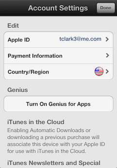
You can change the country of an existing iTunes account quite easily: open the App Store app, scroll all the way to the bottom of the "Featured" tab, tap on your Apple ID, choose "View Apple ID" in the popup, and tap on "Country/Region" to change to the US store.

HT1311_03--account_settings-002-en.png

There is a pretty big downside to this method: your payment details will be reset, which would not be too bad, except that it also loses any recurring subscriptions you have set up. I have a few that I didn’t want to mess this, so I didn’t follow through, and can’t vouch that this method works.

Creating a new Apple ID

I didn’t want to do this because it seemed like it would be a huge hassle, but it’s actually fairly painless. There is only one wrinkle to be aware of. Apple in their wisdom will not let you create an Apple ID from scratch without setting a means of payment. However, if you sign out from your existing Apple ID, then go to install a free app (such as, oh for instance Facebook Paper), you are prompted to log in with an existing Apple ID or create a new one. If you start the process this way, you will then be able to select "None" for your method of payment.

none+iphone+13+11+16.jpg

You’ll need an e-mail address that you have not previously used with Apple to complete the registration. Once you have done this, finish downloading Facebook Paper, then log out of your US account and log back in as yourself.

Facebook Paper should pick up your existing FB credentials saved in iOS and work normally from this point on.


  1. Well, or move physically to another country, but that’s a bit beyond the scope of this post. 

  2. This is the method I used to load Google+ onto my iPad back when it was iPhone only. Remember when we were all excited about G+? 

  3. This page is not really up to Apple’s usual standards: all-lower-case title for a start, and a confusing mix of version numbers and platforms all jumbled together with no explanation. 

iPhone vs BlackBerry

I finally ditched my BlackBerry in December, so this is the one-month-in review.

iphone_blackberry_image-scaled500.jpg

Since it's only a month in, it may well be the case that I've missed something. I just read an article about 40 iPhone features, and I found several I did not know, despite having owned both an iPod Touch and an iPad since before they came out in Europe.

Things I miss from the BlackBerry


  • E-mail tagging. iOS has a flag which you can set, but that's not really granular enough. I end up just using "mark as unread" and then tagging things with Outlook.

  • Reply to calendar events. If some dolt has left off the non-US access number for his conference call, e-mailing him to ask is made that much more frustrating.

  • That red LED. Well, if I'm honest I only miss it some of the time, but I do wish the lock screen had a count of unread e-mails.

Things I don’t miss from the BlackBerry


  • The memory leaks. I had to do a full reboot about once a week as the whole thing would just grind to a halt. This was with careful management of running applications, too.

  • The random freezes and reboots. I thought I just had a lemon, but no - almost all my colleagues with recent BlackBerries have similar stories. It wasn't a problem with several previous models of BlackBerry handsets, but now it's anecdotally widespread.

  • The battery life, or lack thereof. Ok, this was due to age, but that's definitely one of the good things about getting a new device.

  • The physical keyboard. iOS predictive text is uncanny, although it does occasionally get distracted. Putting the iPhone in landscape mode makes the keys plenty big enough for short messages, which is all I ever wrote with the BlackBerry as well if I could possibly arrange it. If it's anything long, I get out the iPad or the MacBook. Most of the use cases that people come up with for the physical keyboard are idiotic, like writing e-mails one-handed while driving. That last is obsolete anyway: iOS dictation is amazing, even without considering Siri. It even works in other languages; I tried French, and it worked perfectly first time. For some reason it doesn't support Italian, but this may be pending release of a gesture API for iOS. The only time I curse the soft keyboard is when I'm unlocking the phone. Corporate IT mandates a secure password, which means 8+chars with a mix of case and alphanumerics. This is annoying to type in a hurry, and I wish there were a fingerprint, iris, voiceprint, or anything recognition option instead.

So that's it. I love my iPhone to bits, while I hated the BlackBerry by the end of our time together. It's also perfectly acceptable as a work device, with filtering and folders just like the BB has. All my complaints are minor, and the one supposedly killer feature the BlackBerry had left - the physical keyboard - turns out to be a non-issue.