Apple Watch
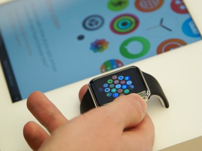
Since I’m in the US this week, I thought I’d go check out an Apple Watch.
You can’t just rock up at the Apple Store though - you need to make an appointment beforehand through Apple’s concierge service. I duly did this, and was greeted at the door by a blueshirt - by name!
The device itself was pretty cool - I particularly like the Watch with the Milanese Loop band - but the try-on experience was underwhelming. The watch you get to strap on is running a canned demo video, which is not interactive in any way. To test the applications, you have to use the Watches that are in the display units with the iPad controllers.

The problem with this experience is that it doesn’t let you try the features I was most interested in: Glances, and the Taptic Engine. I was really curious about these two, and in fact I still am, since I didn’t get to check out either one.
Both of these features relate to notifications. The Taptic Engine is what generates the "tapping" sensation on your wrist that tells you that you have a notification in the first place. It can also be used for other things, such as giving you silent navigation directions. Meanwhile, the idea of Glances is that when you receive that notification on the Watch, you can rotate your wrist towards you, and the Watch wakes up and displays the notification on the screen. At this point you can either rotate your wrist away again, in which case the notification is dismissed, or start interacting with it in whatever way is appropriate.
Based on everything I’ve read and heard, I expect the main value of the Watch to be in its ability to help wearers process notifications. If you can take a quick look at your wrist to see whether a notification requires your immediate attention or not, that is much less disruptive (and rude!) than getting your phone out, unlocking it, and so on. However, I can’t tell how good the Watch actually is at doing that on the basis of a canned demo reel or interacting with stored notifications!
I have also seen some comments that the watch is sometimes slow to display the actual, y'know, watch face. The screen is off when you're not looking at it, but it's supposed to turn on when you rotate your wrist to look at the watch. This was something else that the try-on experience doesn't allow you to test.
I really hope Edition buyers get a more complete experience. Maybe I should have tried for that instead? I was after all conspicuously the only person in the Apple Store wearing a blazer…
If nothing else, one good thing that has come of the Watch is that Apple has redesigned its UK power adapter.
Detail of new-style UK Apple USB plug (included with Watch, or available separately). pic.twitter.com/8PlA9zdz8E
— Matt Gemmell (@mattgemmell) May 6, 2015
I really hope that when the Watch launches in continental Europe, that plug also gets redesigned. The US Apple power adapter, with its folding prongs, is definitely the best to carry around. The UK & European1 versions always seem like afterthoughts in comparison, sticking out and catching on things.
-
Heavy fog in the Channel; Continent cut off. ↩